artHaus
artHaus is designed as a luxury digital experience inspired by brands like the Orient Express, Maison Margiela’s cultural collaborations, and boutique travel platforms. The goal was to evoke a refined, editorial tone — something between an art magazine and a bespoke travel concierge. Every visual and UX choice was made to feel premium, intentional, and quietly indulgent.
time: 1 month
role: UX/UI Designer, Research, Front End Coding (CSS, HTML, Javascript)
team: 3 members (UI/UX, front-end dev, back end, visual design)
tools: Figma · HTML · CSS · Javascript · GitHub

Project Overview
artHaus is a luxury travel website created to help art lovers plan curated visits to the homes of renowned artists. Inspired by high-end cultural experiences like the Orient Express and boutique editorial travel brands, the platform offers a refined, all-in-one solution for discovering, planning, and enjoying these unique cultural destinations.
The project was designed with accessibility and responsiveness in mind, built using Figma for UI/UX design and implemented using HTML, CSS, and GitHub. The visual language aims to blend minimalism with sophistication, evoking the feel of an art magazine meets a personalized travel concierge.
This project tackles a common problem faced by niche travelers: the lack of consolidated resources for visiting artist homes. artHaus simplifies the process by offering curated content, optimized routes, travel tips, and a seamless user experience.
Problem & Goals
Problem
Art enthusiasts often struggle to find centralized, trustworthy resources about visiting artist homes. Planning routes, booking tickets, and organizing trips becomes time-consuming and frustrating, especially for more niche or international destinations.
Research & Personas
User Research
Beyond initial persona development, our team spent considerable time reflecting on the broader audience for a luxury travel platform, recognizing that both affordability and genuine interest would shape who might actually use the service. Two of us, including myself, are practicing artists, which brought firsthand insight into the nuances of the art community and the varied motivations behind cultural travel.
To deepen this understanding, we conducted informal interviews, reviewed competitor platforms, and mapped out user journeys to identify potential friction points. This helped us move beyond assumptions and center the design around real-world use cases. We considered challenges such as budget constraints, accessibility of cultural experiences, and the desire for meaningful, non-performative travel. These insights directly informed how we structured content, prioritized features, and ensured the platform remained inclusive, aspirational, and useful for a wider yet targeted audience.
Goal
Create a visually compelling and highly usable website that simplifies travel planning for this specific audience. The aim was to combine curated content, optimal navigation, and elegant UI to help users feel informed, inspired, and ready to explore.
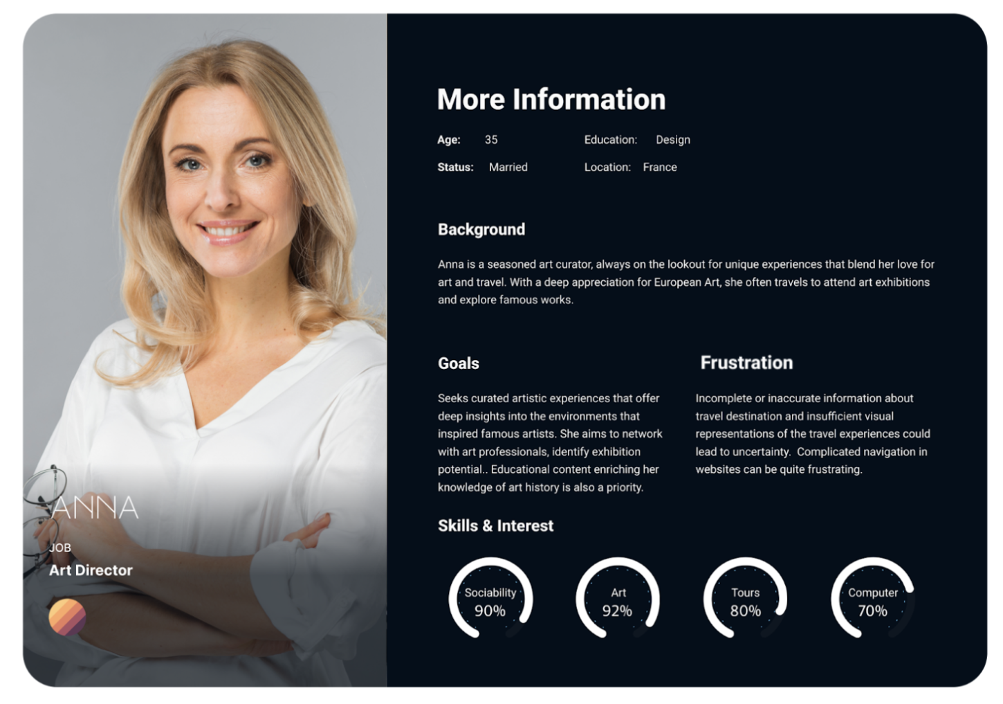
User Personas
This project included key personas ranging from solo cultural travelers to passionate artists and collectors. These informed decisions around tone, layout, and feature prioritization, ensuring the platform stayed useful while evoking a premium feel.
The personas also shaped the user flows, with specific attention to streamlining the discovery-to-planning pipeline.


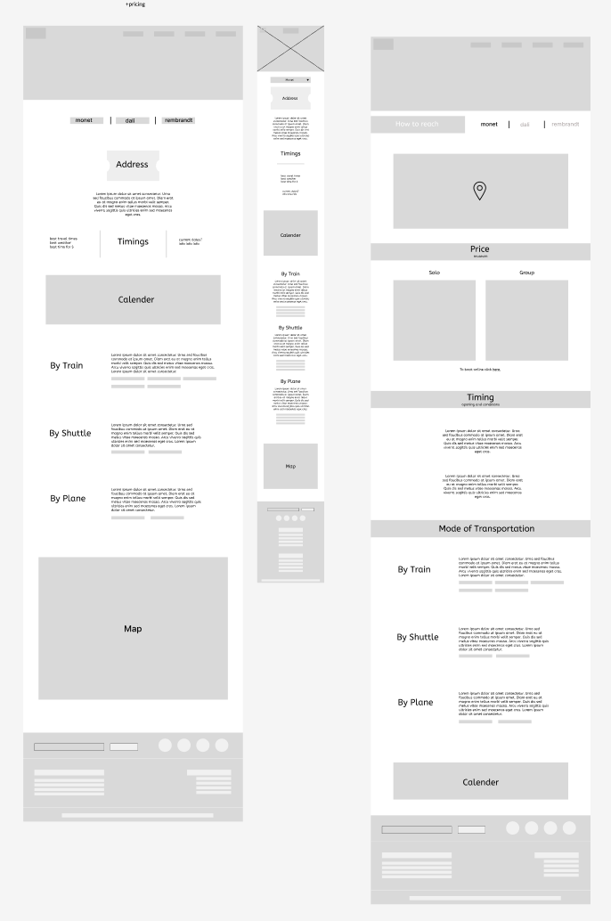
The sitemap was designed to reduce friction and guide users through a logical, minimal-click journey. From browsing artist homes to planning visits. It reflects a lean architecture that prioritizes clarity, intuitive categories, and cross-device usability.
Sitemap
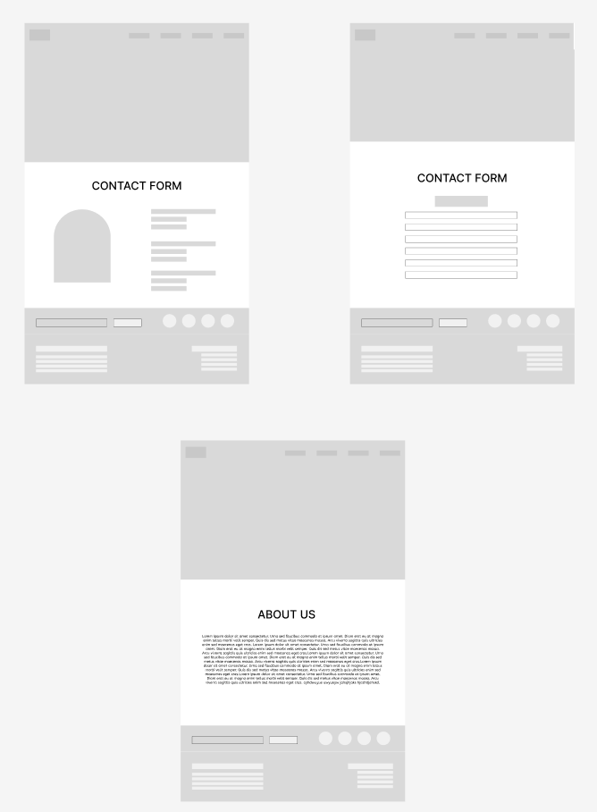
Early Wireframes
Initial wireframes focused on layout clarity, readable typography, and a strong visual hierarchy. Testing at this stage helped refine navigation and ensure content density stayed manageable, especially for mobile screens.


Visual Design & Final Screens
The final UI embraces a soft, editorial design language characterized by large, immersive imagery, elegant serif typography, and a muted, harmonious color palette. This combination creates a sophisticated and welcoming atmosphere that invites users to explore content leisurely while feeling connected to the narrative. Each page thoughtfully balances storytelling elements with practical functionality, reinforcing the concept of travel as both an inspiring journey and a useful, informative experience.
To ensure the design’s accessibility and usability, we developed fully responsive layouts that adapt seamlessly across a wide range of devices and screen sizes. This approach maintains visual consistency and aesthetic integrity without compromising performance or user experience. Special attention was given to preserving image quality, readable typography, and intuitive navigation on smaller screens, so the aspirational yet practical feel of the interface carries through regardless of how users access the site.


Key Takeaways

User feedback highlighted how intuitive and calming the experience felt, with many praising the seamless flow from discovering an artist’s home to visualizing travel logistics. Users especially appreciated the minimal visual clutter, mobile responsiveness, and ease of navigation through dense content.
This project deepened my understanding of designing for content hierarchy and user pacing, especially in a responsive web experience built to scale across devices. We prioritized accessibility throughout development by adhering to WCAG 2.1 Level AA guidelines, ensuring readable contrast ratios, structured layouts, and keyboard-friendly navigation for an inclusive user experience.
I also learned how to collaborate in a live coding environment through GitHub alongside two teammates, which required continuous communication to avoid merge conflicts and ensure our shared components remained functional. Balancing design precision with technical feasibility taught me how to work smarter across disciplines and uphold both UX and visual quality throughout the build.